Ever felt like your mind was a chaotic browser with 47 tabs open all at once? You’re not alone. The modern world moves fast, and finding inner peace sometimes feels as elusive as nailing down the perfect avocado toast recipe. But what if I told you that achieving zen-like calm could start with something as simple—and as overlooked—as color?
In this post, we’ll unpack the fascinating concept of zen color psychology, exploring how different hues can help soothe stress, improve focus, and create a sanctuary for your soul. By the end, you’ll know exactly which colors to surround yourself with for maximum serenity (spoiler: it’s probably not neon green).
Table of Contents
- Why Your Brain Thinks Neon Pink is Out to Get It
- Step-by-Step Guide to Building Your Own Zen Palette
- 7 Tips for Mastering Zen Color Psychology in Everyday Life
- Real-Life Success Stories: From Chaos to Calm
- Frequently Asked Questions About Zen Color Psychology
Key Takeaways
- Colors aren’t just pretty—they have measurable effects on mood and mental health.
- Natural tones like blues, greens, and soft earthy neutrals are often linked to feelings of calmness.
- Over-stimulating shades (think bright reds or fluorescent yellows) might actually increase anxiety levels.
- You don’t need a complete home makeover; small changes can make a big difference.
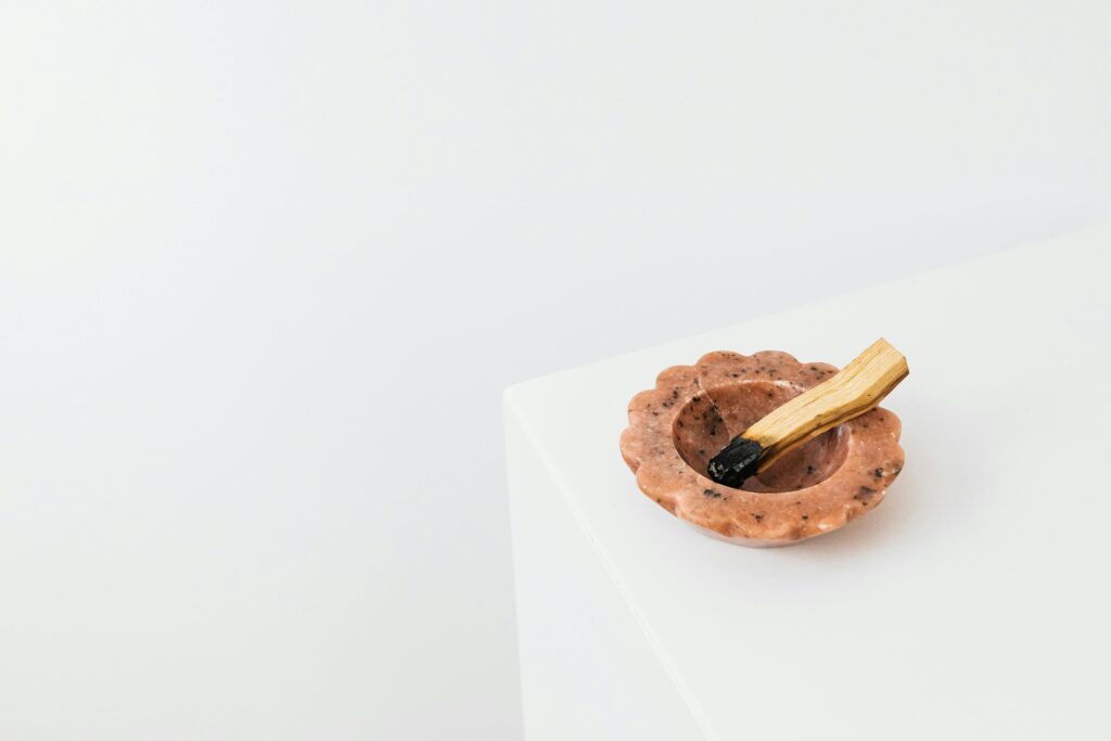
Why Your Brain Thinks Neon Pink is Out to Get It
I made an embarrassing mistake once—I decorated my office in a shade of electric pink because it seemed “fun.” Two weeks later, I was Googling “why does everything feel louder?” Turns out, overly saturated colors can overstimulate your senses, making relaxation nearly impossible. Who knew?
Color isn’t just about aesthetics; it’s deeply psychological. Studies suggest that certain colors trigger specific emotional responses due to their associations in nature. For example:
- Blue: Evokes water and sky, promoting tranquility.
- Green: Mirrors lush landscapes, sparking renewal and balance.
- Red: Associated with urgency and energy—great for workouts but terrible for winding down.

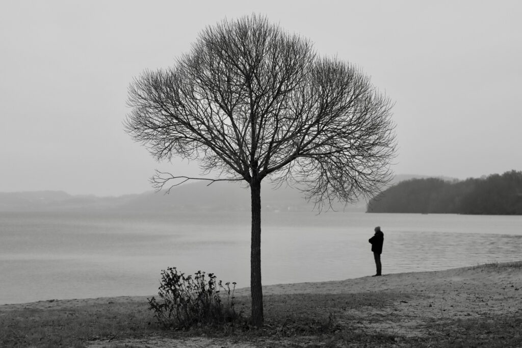
Figure 1: A soothing color palette inspired by natural elements.
“Optimist You:” ‘This is life-changing!’
“Grumpy You:” ‘Ugh, fine—but only if I get to keep my black coffee mug.’
Step-by-Step Guide to Building Your Own Zen Palette
If you’re ready to bring some peace into your life through color, follow these steps:
Step 1: Identify What Stirs Up Stress
Do flashing billboards make you jittery? Does a cluttered desk leave you feeling frazzled? Pinpoint visual triggers that disrupt your calm.
Step 2: Choose Soothing Base Colors
Select neutral tones such as ivory, taupe, or pale gray. These act as a foundation, creating a sense of stability.
Step 3: Add Natural Accents
Incorporate shades of blue (like ocean waves), green (like forest canopies), or lavender (like dusk skies) to evoke peaceful imagery.
Step 4: Test Before Committing
Use apps like Pantone Studio or even paint swatches to see how new colors interact with existing spaces. Small tweaks can go a long way!
7 Tips for Mastering Zen Color Psychology in Everyday Life
- Declutter First: A messy space will overshadow any color magic you try to work.
- Go Natural: Wood textures paired with muted greens create instant harmony.
- Limit High-Impact Hues: If you adore red, use it sparingly—think accent pillows instead of walls.
- Prioritize Lighting: Soft lighting enhances calming colors while harsh fluorescents dull them.
- Think Seasonal Shifts: Swap out warmer tones in winter and cooler ones in summer to match your mood.
- Create Zones: Dedicate areas for activity (brighter colors) versus rest (softer shades).
- Ditch Trendy Fads: Sorry, neon lime yoga mats won’t foster inner peace.
Real-Life Success Stories: From Chaos to Calm
Mariah, a graphic designer from Portland, transformed her chaotic workspace by ditching harsh overhead lights and painting her walls a serene seafoam green. “I used to dread coming to work,” she shares. “Now I look forward to sitting in a space that feels like my personal retreat.”
Mark, a high school teacher, took a more budget-friendly approach. He swapped his bold red curtains for light linen panels and added a few plants around his classroom. His students reported feeling more relaxed during exams—an unexpected bonus!
Frequently Asked Questions About Zen Color Psychology
What is zen color psychology?
Zen color psychology refers to the study of how colors impact mental wellbeing and inner peace. Certain hues are known to calm nerves, boost mindfulness, and encourage deeper self-reflection.
Which color should I avoid for better sleep?
Definitely steer clear of bright reds and neon shades near bedtime—they stimulate rather than relax.
Can color really affect productivity too?
Absolutely! While cool blues promote focus, too much white can feel sterile and uninspiring. Balance is key.
Conclusion
Finding inner peace doesn’t require a Himalayan retreat—it starts right where you are. With the power of zen color psychology, you can transform your environment into a haven of tranquility. Start small, pay attention to what works for YOU, and remember: even tiny shifts can lead to profound change.
And now, here’s your daily dose of whimsy:
Zen whispers low,
Colors dance in quiet glow,
Peace begins within.
Cheers to quieter minds and calmer days!